Branding Trends·5 min read
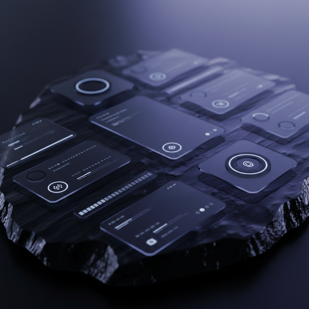
Why Dark Mode Branding Is Dominating 2026
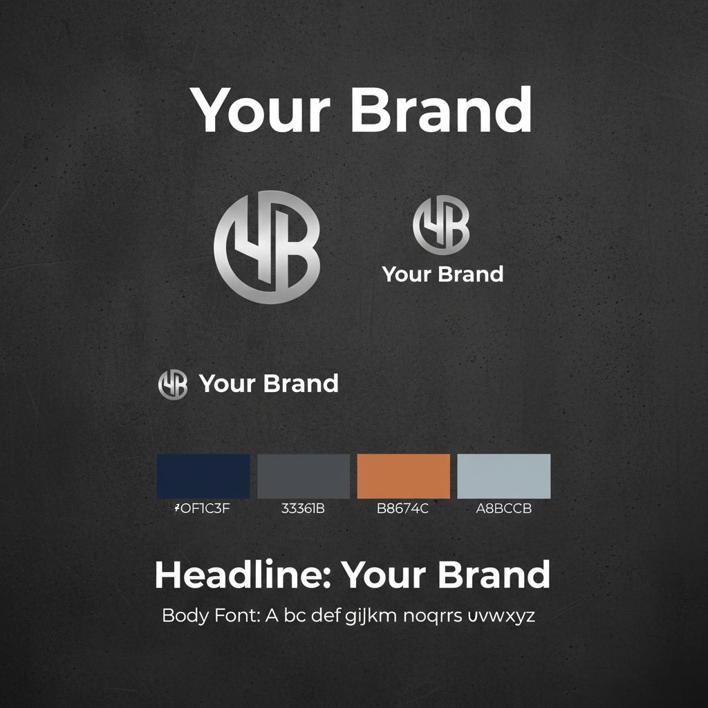
Dark palettes are no longer just a UI preference — they've become a powerful brand signal. Here's why the most memorable brands are going dark and how to do it without losing identity clarity.
Read Article
Jun 10, 2026